This Week In Veloren 10
Lots of UI concepts this week. Also, a big change to the GitLab repo, and the start of a programming manual for Veloren. This week's blog was edited by @AngelOnFira, with the art section curated by the one and only @Pfau!
Programming
A pretty big change this week involving the GitLab repository. While we've been refactoring the codebase, we've used the name "fresh". Now that we are at a more stable state, it's about time that it was changed. You can see the new repo here. As you may notice, there is only one star on the repo right now. Let's change that! Stars help projects become more visible and more reputable. Also, the old version of Veloren has 82 stars, so it seems much more attractive than this version. If you could add a star it would really help. :) The new veloren repo :)
@xMAC94x has been putting in lots of work this week on the networking side of things. He and @Yuri have been working to solve some networking issues. Most of the work was on creating a better log system for the public server. An issue that came up was if a client's ping was too high, they would be kicked from the server.
Finally, there has been ground work on the Veloren programming manual. You can see how it's going here. This documentation will be automatically generated automatically from the codebase. A lot of work needs to be done to get it to a usable state, but hopefully it will help new developers get on board more easily.
Art
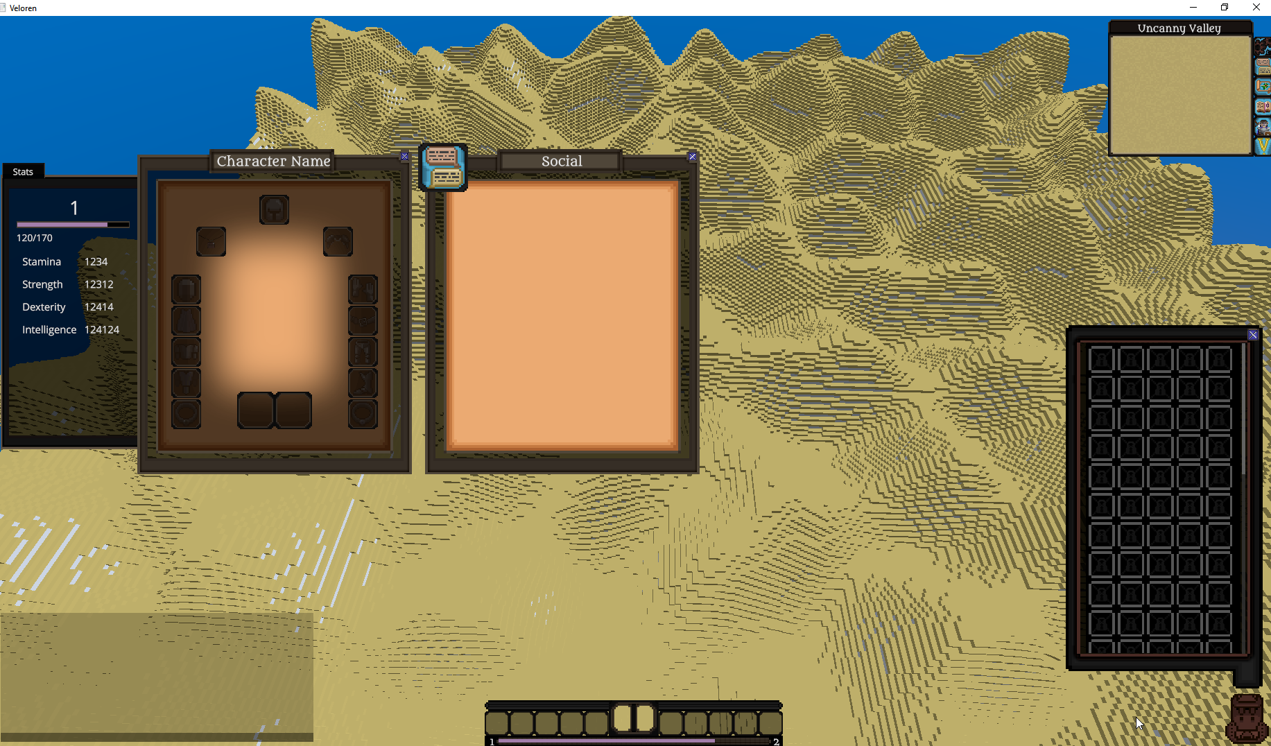
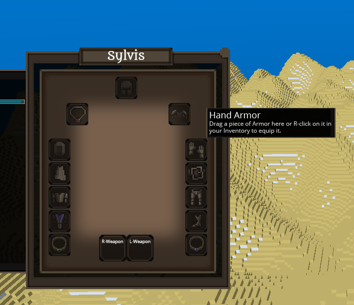
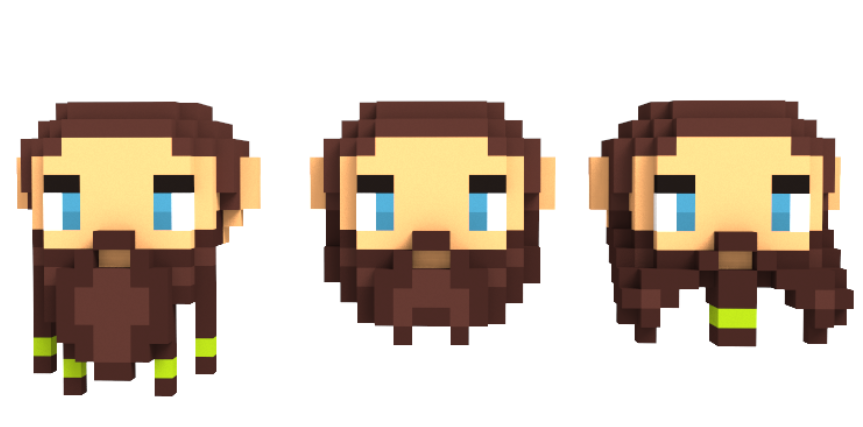
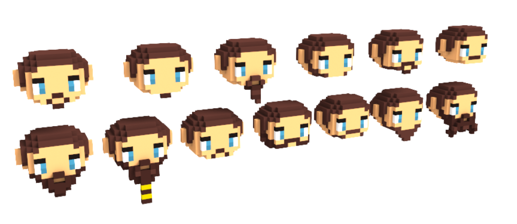
Lots of art content this week! One thing that's new this week, instead of making SVG files for better scaling we decided to render actual VOX files for the interface elements. This will help with scaling for different computers while keeping the icons looking the same. Concept of the character window How it actually looks like in the game right now. XP-bar, health and mana bar (colors are subject to change!) Again, alongside with other windows. The most interesting thing here is the inventory with the locked slots and the scrollbar. Concept of the mouseover. The text is subject to change and was just for testing purposes. Beardstyle experiments Possible look of future item icons Empty item slots background art Birds by @Demonic


