This Week In Veloren 89
This week we hear from @Sam about a staff overhaul. @Pfau gives us an update on how UI changes are coming, and some concepts for future consideration.
- AngelOnFira, TWiV Editor
Contributor Work
Thanks to this week's contributors, @xMAC94x, @Pfau, @Imbris, and @XVar!
Staff Overhaul by @Sam
I have a staff overhaul that'll be in-game shortly.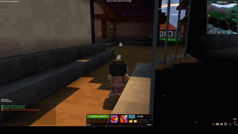
The new M1 will be an explosive projectile similar to the old third ability. It will do a smaller amount of damage, and will restore energy on hitting an enemy. It will also be affected by gravity.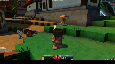
The new M2 will be a flamethrower-like attack. It uses the same beam system as the healing sceptre M1, however with a much wider cone, and a faster tick rate.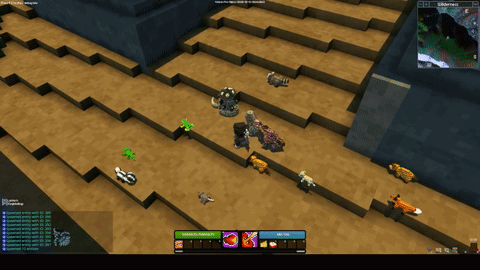
The new 3rd skill will be a radially directed fire shockwave. It'll have a short range though.
New Skill Bar and Buffs Visuals @Pfau
Hello, Pfau here. Recently I've mostly worked on UI-Code and visuals, 3D models, and 2D pixel art for Veloren. Normally you’d find my (free!) blog entries on my Patreon but this week it’s time to get you guys an update in the Veloren general blog. I’ve been working on finally implementing the UI concepts I showed off some months ago. Concept, not functional UI!
We are working on switching our UI library from conrod to Iced, however it is being held up as Iced still lacks some features needed for Veloren. Once it is ready, these looks will be implemented concurrently to the switch. Why am I bringing this up then? While working out a concept to display the player’s buffs and debuffs I realized that I needed a way to save vertical space to not block the view on the game world.
Our current skill bar visuals are around a year old and still the same as in version 0.3. The health and stamina bar (previously the mana bar) had options to show different colours for "focus" and "rage".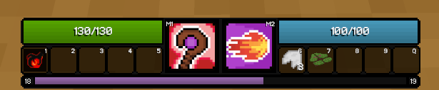
While this bar has good overall visibility of objects it isn’t really made to save vertical space or add any new parts. So how do keep our currently used space, add buffs, and get a style fitting the other current UI elements? Like this: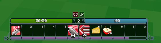
This new skill bar design merges our current style with the features shown in the concept while only making our skill bar 2px vertically taller than the one we currently use. It has:
- "Blobs" for the experience-bar to see more easily at how much % experience you are currently.
- A display of the current level
- Smaller health bars to make room for buffs/debuffs above them
- Left and right mouse button icons to indicate what the middle slots do
We are currently hard at work integrating buffs into the UI. The groundwork and functionality is done so you can expect the feature to be added to master in the next weeks. Here are some images of the working buffs.
This is me testing the sorting logic and placing. These little squares are fully animated. They show the remaining time in little clock-like slices. And start flashing when their remaining duration is below 10s. The maximum amount shown is 22 per side (internally there can be more)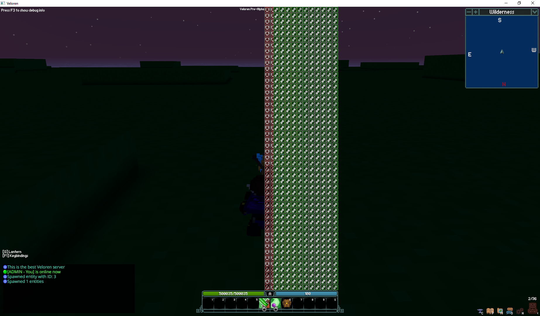
...this happens without a limit and sorting being messed up! Exploring a large cave system. See you next week!